Sunday, September 27, 2020

Mondrian Inspired Primary Color Abstract Design

Kindergarten
1 Class Period
50 minutes
Mondrian Inspired Primary Color Abstract Design, Kindergarten Art Lesson


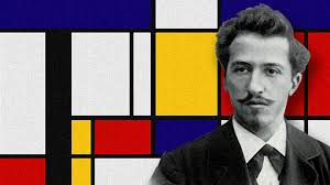
About the Artist: Mondrian was born in 1872.  He began his painting career by painting realistic paintings of landscapes and portraits of people.  Eventually, his artwork took on more of an abstract look.  He became enthralled with the use of primary colors and geometric design.  Mondrian's goal was to create the most perfect harmony he could within the composition of his artwork.  The artist past away in 1944.

Day 1:
Students view a power point presentation on artist Piet Mondrian. I used this lesson to introduce the primary colors to the students. We discuss his life and look at this artwork in great detail.  I used this lesson to introduce the primary colors to the students. Students are then shown examples on how people are still inspired by his artwork today.

Students selected a 9 x 9 inch square in either red, yellow or blue.  They glued a white 8 x 8 inch square in the center of the 9 x 9 inch square.

Students were then given an assortment of red, yellow and blue pieces of paper cut in various sizes of squares and rectangles.  We discussed composition and placement of these pieces on the white paper.  Students were reminded to glue carefully.  We did not want our squares and rectangles to turn into diamond shapes due to sloppy gluing.


The last step was to place black strips over the artwork.  I have these ranging in size from 1/2 inch x 8 inches, to 1 x 8 inches and 1.5 x 8 inches.  Students were reminded to only glue the strips in horizontal and vertical placements and to be careful of creating diagonal lines with sloppy gluing.
Carefully planning out how black strips will lay on the composition.
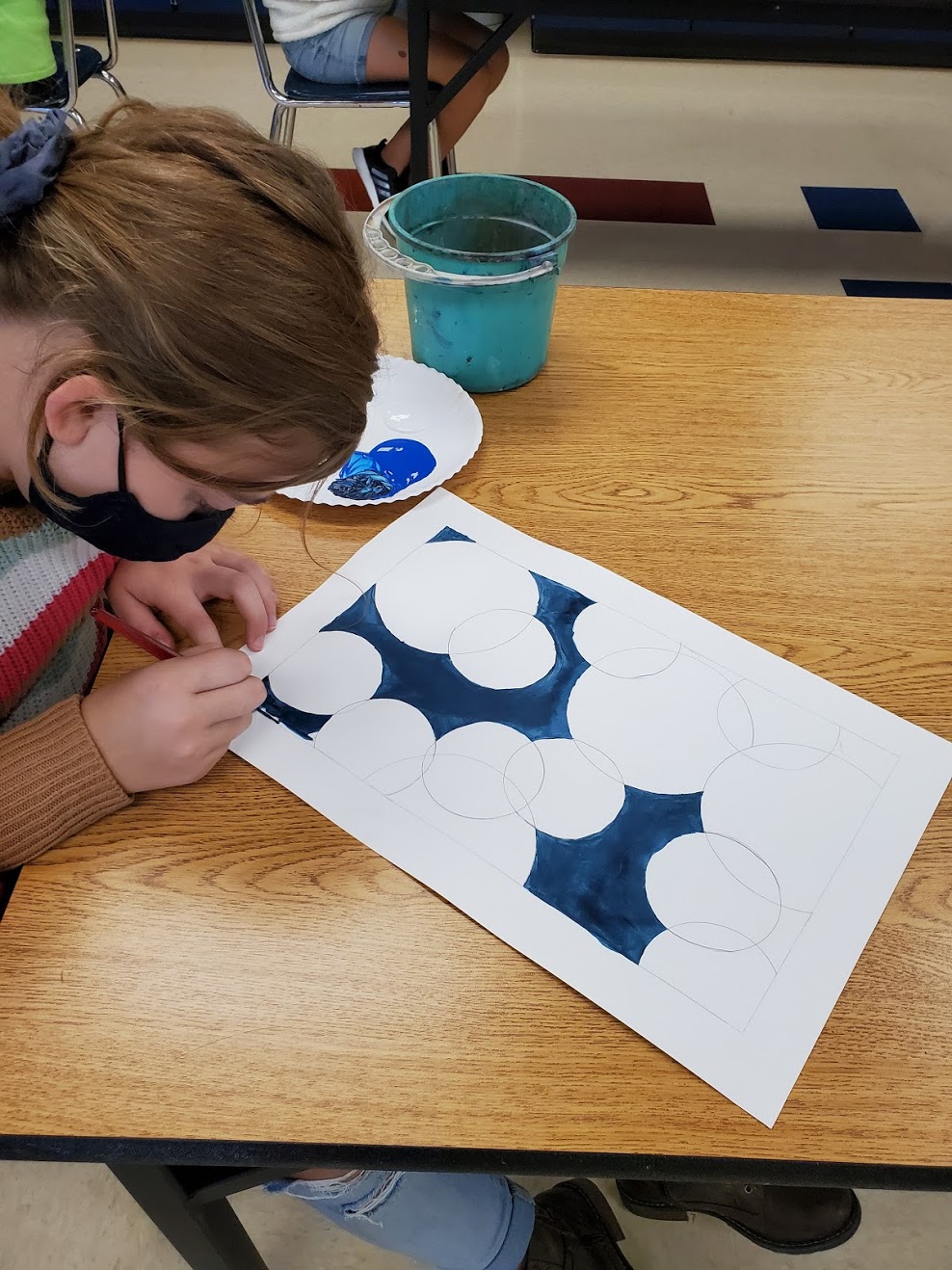

Student Examples:


Sundaes Inspired by Wayne Thiebaud

 Sixth Grade Art Lesson

3 class periods

42 minutes per class

Sixth Grade Art Lesson, Sundaes Inspired by Wayne Thiebaud

I usually do this lesson with cupcakes as our subject matter.  I bring cupcakes to class and have the students draw the cupcake from observation.  However, this year we are not allowed to bring treats to school to share due to COVID.  So I decided that I needed a new spin on this lesson and decided to do ice cream sundaes.  I printed off numerous examples and created a handout of different types of sundaes for the students to look at for reference.  They still seemed to enjoy this lesson and loved to color with the oil pastels.  They were also very excited to discover that Wayne Thiebaud was still alive today and will be 100 years old in November!  

Day 1: 

To begin this lesson, I introduce the students to artist Wayne Thiebaud.  Most of the information that I share with students can be found on this link that gives the steps to my cupcake lesson.  Wayne Thiebaud Cupcakes.

After we watch and discuss the YouTube video, student began to draw sundaes on 12 x 12 inch colored construction paper.  I give students a handout on sundaes for reference, but they are allowed to put their own creative spin on their drawings as they wish.  They are expected to incorporate a shadow in their composition and a horizon line.  Remind students to draw large.  Fill up the space!

Once the drawings are complete, I have them go over their pencil lines with a sharpie marker.

Day 2:

On the second day of this lesson, I give some tips on how to blend with the oil pastels.  I give a demonstration on how to create a glass effect using white and blue oil pastels.  We also discuss different ice cream flavors and how we could mix oil pastels to create those colors to represent the flavors we want to create.

Day 3:

This day we use to finish up coloring our creations.  I have students color the table and the shadow in their composition.  I also, demonstrate how to create highlights on different parts of the composition such as on a cherry or a spoon.  I inform students to use a black oil pastel to carefully outline pieces int the composition that need to pop out a bit.  I also, ask them to assess their back ground and if it seems to be filled with smudges and fingerprints, I advise them to consider to color the background.

Student Examples:


Tuesday, September 22, 2020

Complementary Circles Abstract Design

 Sixth Grade Art 

4 to 5 class periods (40 minutes each)

Complementary Circles Abstract Design, Sixth Grade Art Lesson

Supplies:  
12 x 18 inch paper, pencil, eraser, ruler, circle stencils, flat brushes, water buckets, liquid tempera paint, painting palettes

I can:
*  create an abstract painting.
*  use a complementary color scheme.
*  create tints and shade with paint.

Day 1:

On the first day of this lesson the following vocabulary words were discussed:  abstract art, complementary colors, tints, shades, negative space and positive space.    I like having students write down their vocabulary words on the back of their assignment.  Once we were done note taking, we created a border on our 12 x 18 inch paper using a ruler.


Border around 12 x 18 inch paper.

Using some circle templates (lids work well for this) have students trace circles into their composition.  I had them draw 4 to 5 large circles and 8 to 9 small circles.  Circles can overlap or look like they are entering or leaving the composition.  Circles should not go outside the border area.


Circles added in the composition.

If class time allows, have student take one of the colors of their complementary color scheme and create a shade with it.  I demonstrate to student how to carefully add black to the hue.  You want to add a tiny bit at a time so that the color does not get too dark too fast.  Using this color, students may begin to paint the negative space within the composition.

Painting the negative space.

Negative space completed.


Craftsmanship is highly stressed for this lesson!

Day 2:

Students begin class by finishing the negative space of their backgrounds.  I made sure students paid attention to how they mixed the color the class before so they could mix it again if they needed to.  

Next, I have students count the number of spaces they have left to paint in their composition and divide that number in half.  Example, if a student says they have 20 spaces on their paper to paint, I inform them that they will be painting 10 spaces today.  

Using the same complementary hue as the previous class students are now shown how to create tints.  For the remainder of the class period they paint the circles and parts of the circles using shades and tints of that hue.  Remind students to leave some circles white for the complementary color's opposite hue (that will be done during the next class period).

Tints and shades being added to circle composition.

Day 3:

Today we use the complementary color's opposite to paint the remaining circles.  Students once again create tints and shades of this color.  If they finish, they can go back and paint any areas that they did not complete from the class period before.


Project completely painted with tints and shades of both complementary colors.

Day 4 and Day 5:

Depending on how slowly your class works you may need an additional day for painting.  The very last step is to outline with black paint 6 circles.  I inform students that these may be circles that seem a bit messy to you and would look better if they were touched up a bit.

Black outline added to 6 circles.

Again, stress craftsmanship for this lesson.  I found this lesson to be very relaxing and peaceful.  Student love to mix paint!  You could hear a pin drop they were so quiet concentrating on being careful with their brush.

Student Examples: